zocdoc provider dashboard & business model flip
Zocdoc is a healthcare company that allows patients to discover and book with doctors online, and helps doctors grow their business.
I was the lead IC designer on all things related to one of the biggest projects in our company's history: transforming our business model for massive scale. A central challenge crucial to success of this flip from a subscription to variable revenue model was figuring out a way to convey to doctors the value Zocdoc provides to their practice - an ambiguous concept we'd never attempted in our UI before.
After significant discovery work, iteration and validation, we shipped to all doctors in America a new provider dashboard that puts doctors' performance front and center; a new budgeting system; and a new provider design system (see breakdown in next section).
OneNote for Windows UX Refresh
OneNote is a digital notetaking app for both quick capture and long-form notes that exists on 6 platforms. I worked largely on the Windows App on Windows 8, 8.1, and 10.
We faced a variety of UX challenges, including:
-
Content discovery (quick note retrieval)
-
High learning curve even for basic notetaking
-
As a default app on the Windows OS, adapting to ever-changing Windows design patterns
Solution
I drove the following UX solutions:
-
Designed page previews to make content more discoverable and adopt Windows 8 touch-first guidelines
-
Designed the mobile commanding toolbar for page canvas controls, improving command usability
-
Updated desktop and tablet commanding infrastructure, reducing the high learning curve

Before and after: Page previews celebrate a user's various content types, make the app more visually engaging, and aid in quick note retrieval

Before and after: The new mobile commanding toolbar brings key notetaking commands to the top level, making them more discoverable and quickly accessible
My role / The team
Role: Design, user research & testing, project management
Team: 1 product designer, 2-3 engineers per project
Page previews
The goals of page previews were to:
-
Improve content discovery
-
Make the app feel more fluid & responsive
-
Optimize OneNote for touch
After preliminary research, I brainstormed and sketched out early concepts. User content should be beautiful yet recognizable, while celebrating the various content types (text, images, stylus ink, etc.) Ideas included giving images hero treatment and displaying live-updating ink in previews.

I conducted several dozen flash usability studies on iterations of ink, list, table, text, and image arrangements, with actual users' content to replicate real-world use cases.

I realized there was a tradeoff between preview fidelity and quick recognition of the user's page. Testing helped me find a balance. For example, a user's handwriting is recognizable to them, so users wanted to see it fill up the preview. Tables are more generic, and users preferred a lower-fidelity representation.
The final preview design revamped OneNote's look and feel. Lightweight and dynamically updating in real time, page previews put user content front and center, and help users find their content faster.

Desktop & tablet commanding
The previous commanding model in OneNote for Windows 8 was a contextual formatting "radial menu". Though unique and fun to use, it had significant discoverability and scalability problems, including:
-
Initial discovery. Menu options changed based on the user's selection. For example, many users thought basic commands like font formatting weren't available because they didn't have text selected.
-
IIlogical groupings. With the drill-in model, commands like "Strikethrough" were only accessible through the top-level entrypoint "Bold".
-
Not scalable. The rigid eight-command structure made it challenging to easily add entrypoints for new features.

Illogical groupings made commands undiscoverable: commands like Strikethrough and Indent lived under the top-level "Bold" entrypoint
In the new model, I wanted to minimize the high learning curve that existed with the radial menu. I explored models that provided quick access to the important notetaking actions.
Initially, I hypothesized that a minimal model with a 4 commands + ellipses (for 'more') would help users naturally focus on the most important things while retaining access to the rest. It turned out the '...' entrypoint, a common Windows pattern, was hugely unrecognizable by participants.

After much iteration, I arrived at a well-tested solution: a modified, lightweight version of the desktop ribbon that users knew and recognized. Quick-capture controls were prominent on a "Home" tab that emphasized the OneNote value proposition, with other commands logically grouped under tab names.

Mobile commanding
Our existing mobile commanding model had usability and discoverability problems, with important notetaking commands (e.g. bullets and basic formatting) buried under a text-heavy drill-in menu. This set-up wasn't optimal for on-the-go mobile notetaking.
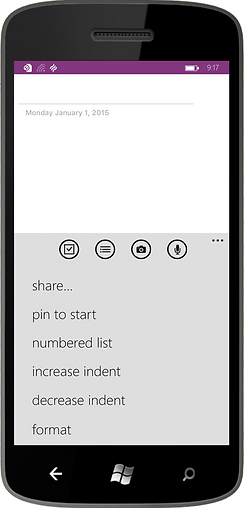
Before: Key mobile notetaking commands are buried under a heavyweight, undiscoverable menu
For the Windows 10 update, I explored models of varying complexity, including a command bar above the keyboard, and a half-sheet of commands overlaying the keyboard. When tested on device, users felt that commanding in the latter model was too hidden and heavy.

Ultimately, I landed on a pared down, easy-to-access command bar above the keyboard, and implemented the following solutions in the final design:
1) Brought key notetaking commands to the top level for easy access
The previous text-heavy drill-in model made most actions hard to discover. The new model provided quick access to key note-taking commands.
2) Reduced cognitive load
I removed all commands that weren't core to the mobile experience, leaving behind only those that were actually relevant in these scenarios.
3) Provided scalability for current and future commands
The toolbar is designed to be scalable both vertically (2-level) and horizontal (scrolling).

After: Key notetaking actions are easily accessible through the commanding toolbar, optimizing the mobile app for on-the-go notetaking scenarios
I worked closely with developers and partner teams to design within technical constraints, and create new controls that could be consumed by other teams. Soon the Outlook team saw the value in our mobile app bar solution, and ultimately also implemented it.
Outcome
Page previews
While we accomplished our touch-first goal, it turned out that Windows 8 ended up having many more mouse and keyboard users than anyone had expected. As a result, we received some initial negative feedback, since previews were not optimized for these users. We responded to customer feedback by designing an on/off preview toggle to provide users the best experience based on their device.
Mobile commanding
Soon after release, our mobile app rating increased from mid-3 range to 4.8. The toolbar contributed to this by improving overall usability and discoverability, which led up to a 20% increase in key notetaking commands. The success of the new commanding ultimately influenced Outlook to adopt it too.
Desktop and tablet commanding
As expected with a major UX update, we heard from a subset of users had become familiar with the radial menu and wanted it back, but this feedback dropped off quickly. We saw an almost immediate drop in confusion around OneNote's core functions, like striking through a note to mark it as done.