zocdoc provider dashboard & business model flip
Zocdoc is a healthcare company that allows patients to discover and book with doctors online, and helps doctors grow their business.
I was the lead IC designer on all things related to one of the biggest projects in our company's history: transforming our business model for massive scale. A central challenge crucial to success of this flip from a subscription to variable revenue model was figuring out a way to convey to doctors the value Zocdoc provides to their practice - an ambiguous concept we'd never attempted in our UI before.
After significant discovery work, iteration and validation, we shipped to all doctors in America a new provider dashboard that puts doctors' performance front and center; a new budgeting system; and a new provider design system (see breakdown in next section).
Microsoft Classroom
for iOS & Android
Middle and high school students' lifestyles have shifted from routine to unpredictable. They're overwhelmed with after-school activities, practices, and other obligations. As a result, students struggle to efficiently stay on top of their homework in a way that accommodates their on-the-go lifestyles.
Solution
Microsoft Classroom for iOS and Android is the mobile hub for Microsoft's education suite. The app increases student productivity by providing them a streamlined way to prioritize, work and collaborate on, and submit assignments from wherever they are.
Demo video
Google Play screenshots

My role / The team
Role: I did all the UX / Interaction design and oversaw development of this 'v1' app, with participation in user research, project management, and visual design
Team: 1 interaction designer, 1 visual designer, 1 user researcher, 3 engineers, 1 product manager
Process
Understand the space
To clarify existing shortcomings, I needed to better understand how my customers used technology, did homework, and turned in assignments. I did this through:
1) School visits
At 5 schools, my team and I observed diverse students and teachers. Key learnings included:
-
Students already use mobile phones to keep track of their homework, but often unsuccessfully, since current methods require manual input. What students really wanted was just a simple list of all their assignments so they could prioritize what to work on next.
-
"Working on an assignment" and "submitting it" often occurred at two different times. While students would often have an assignment almost done on the computer, they couldn't submit it until they were again near a computer, which was often inconvenient.


2) Teacher interviews
My user researcher and I spoke with 6 diverse teachers to better understand the teacher / assignment / student workflow. One insight we learned was that up to 10% of students don't have internet at home, which encouraged me to continue thinking of mobile as a viable alternative to web for working on assignments
3) App analysis
I played with many existing homework (or related) apps from the App Store to learn from what's already been done. Some patterns that shaped my design thinking included use of color for class hierarchy and typography to emphasize the most crucial information, the assignment due date.
Information synthesis & UX goals
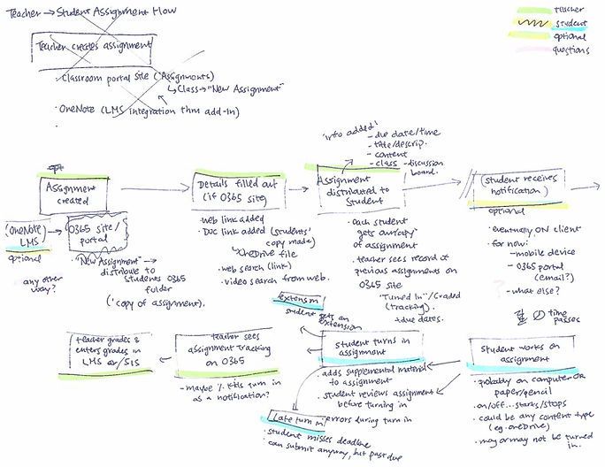
From the research findings, I mapped the assignment lifecycle through creation, distribution, and submission to better understand the teacher/student and Office 365 technical flows.
Together this led me to define 3 UX goals:
1. Give students a super simple way to know what they need to work on next
Create the right balance between quick and detailed views of crucial assignment information.
2. Keep students in sync with their assignments by taking advantage of the mobile platform
Students always have their phone (not their computer) with them. Take advantage of mobile by providing things like due date reminders and remote work submission.
3. Make students feel good
Students say homework is "sad" and "boring". Create an app personality that makes the user feel great being productive.
User flow and Wireframes
I sketched a flow of the portion of the assignment lifecycle that this app would focus on: students viewing and turning in assignments. This helped me organize the required scenarios and views going forward.

Below are some early wireframe drawings that incorporated these flows and user goals, like defaulting the user to a simple "To Do" view where I expected users to spend 90% of their time.


User studies & Iterations
Our team’s researcher and I tested my latest prototype every week with 4 students in our usability lab. These regular studies had enormous impact on the ultimate design. Some modifications made include:
Popover as the navigation model
In testing, users disliked the initial hamburger/drawer model to switch classes, which felt heavy and out of context. I came up with a lightweight and contextual popover model, which they strongly preferred.
(Video) Popover model
Working together
(Video) Hamburger model
The direct team
This project involved incredibly close interaction among my direct team. I regularly discussed design and technical tradeoffs with engineers, and provided direction on design priorities. My visual designer and I worked very closely providing input and ideas to each other's area of focus.
The large team
We kept our latest designs up in the hallway to get fresh perspectives from the larger team of designers, engineers, and PMs. For instance, originally a OneNote entrypoint was hidden in a submenu by default. When the PM on a OneNote project saw this, he suggested showing the logo at the top level. Since OneNote is at the forefront of our Education team efforts, this way we could tell a more cohesive story.

Interaction details
Primary View: "To Do"
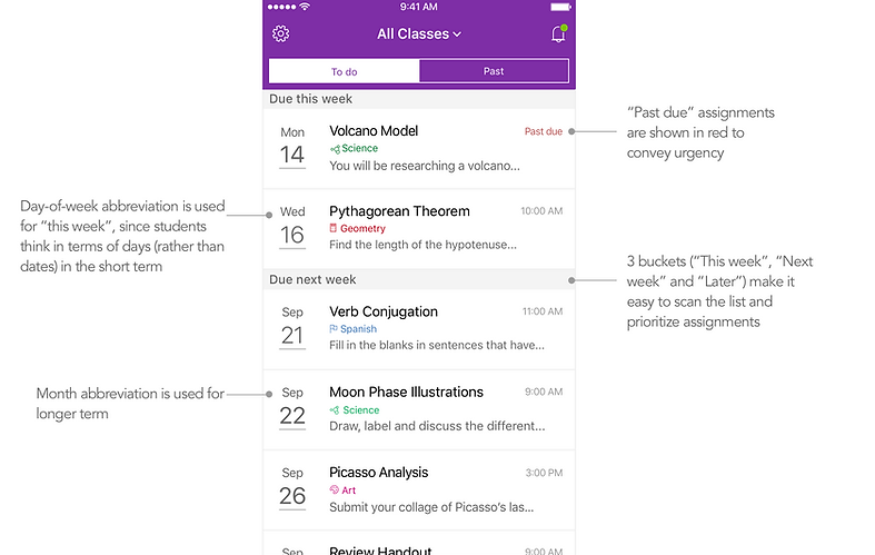
"Past" view

Cell view

Navigation and Class view

Assignment Details view
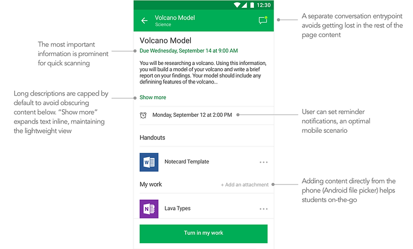
Assignment Turn in

Reminders

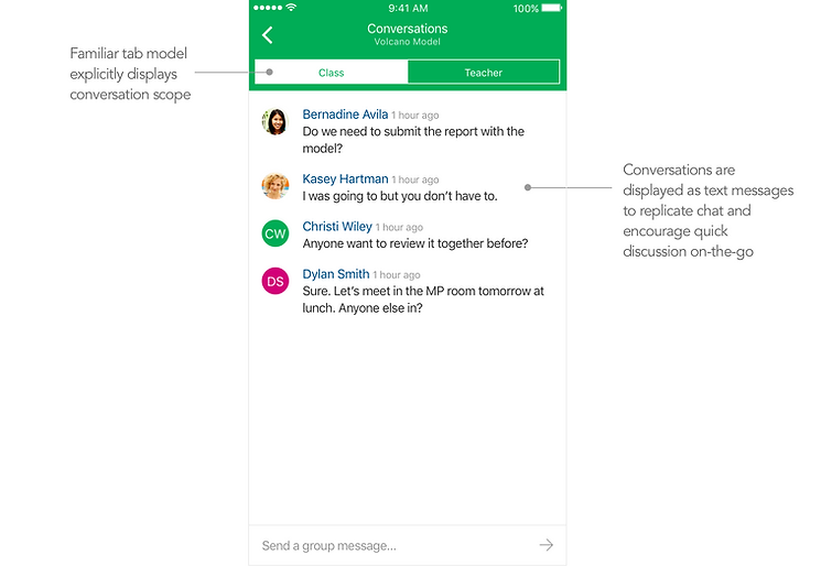
Conversations
Outcome
Microsoft Classroom shipped earlier this year to schools worldwide. So far, overall response from students and teachers has been very positive. These are the early stages - we are continually evolving the app in response to customer needs and feedback, which we gather through visits and weekly calls with partner teachers and students.